
The Post Card Assignment
Return to Class Page | See the Movie Poster Gallery | See the Memory Piece
This is one of my favorite assignments... the Postcard. It utlizes font managment as well as masking techniques. The idea is to recreate those cool post cards of bygone days, but bringing them up to date. The student work speaks for itself.
Jennifer Beyerlein
This is one of the finest postcards of the set, and that's why I put it first. Jennifer not only did a lovely job with composition and image masking, but the letters fit tightly but legibly on this specification. This card wold be a top seller.
Megan Peterhans

Excellent execution. There is good use of lighting effects on the background, and the letters are wonderul. Great choice of imagery. I love that fat lighthouse the best. But the sunset in the letter U is just too good.
Adam Nettleton

Great dimensional look and feel, and I really enjoy photo choices.
Joyce Berendes

We collaborted on this, but I really enjoy the image choices and how the lettering was handled. Great lighting effects.
Julie Connors
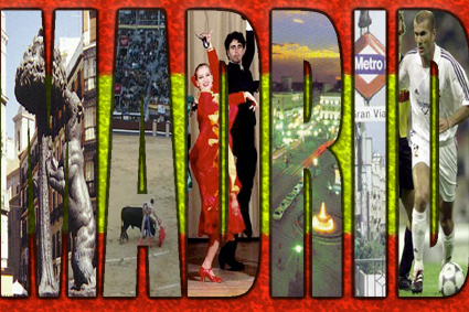
I thoroughly enjoy this depiction of Madrid and the image choices. The background provides just the right contrast to the letters in this very complex but legible design. Good job!
Roberto Marrero-Alivira

This guy can probably make a living doiong post cards. Roberto is a student of mine from previous classes, and he is highly creative and it shows in everything he does.
Todd Hittenmiller

Todd Hittenmiller hitahomer on this strong piece. I love the letter choices and how he handled the imagery.
Jennifer Christopher
This is excellent. This is a future Photoshop Master.
Mayland Marrero-Alvira
Gosh I love this card. The background, the way the letters contrast with the background (thanks to the outline which really distinguishes this design, and the photos all good choices.
Jackie Gregorich
A phenomenal layout and masterful use of Photoshop's masking layers. The background on this is the best. The shell in the cordner looks pasted on however. We could probably drop shaddow that for better effect.
Rebecca Meana

Simple but effective. I really enjoy the choice of imagry, here, and the simple lighted background, making use of the Render Lighting Effect command, was used very effectively.
Brian Ernst

Brian did a spectacular job on this, especially in his choice of background image of a corn field. Working in layers in Photoshop provides plenty of room for experimentation. The image is totally liquid, able to change on a whim of the artist.
Courtney Hundt
Extraordinary! Don't you love the use of different and subtle values depicted in the images chosen for the individual letters. It's so Oregon.
Jason Betke
Very cool with the bricks. Great background, and good choice of font and photographs.
Andy Schroeder

What a perfect choice for a post card... the fabulous city of New Orleans. Plenty of inspiration, and I love that background texture, the product of Photoshop's texturizer filter.
Tara Griffin

Hawaii never looked so good on a postcard. The background is a sand finish with hand rendered footprints embossed into it.
This is a Gary Olsen Production
