Welcome to the PhotoShop Bootcamp Student Gallery, brought to you buy Clarke College! Below are the ongoing assignments completed by our students. Enjoy other galleries in this Web site by clicking on the links below.
Gallery 3 - The Memory Piece
Go to Gallery 1, The Movie Poster | Go to Gallery 2, The Postcard
The concept is quite simple.... and it's a perfect exercise for learning how to really leverage the technology that is contained in PhotoShop. For example, the idea of combining a variety of 2-dimensional and 3-dimensional objects into a composition utilizes digital photography as well as scanning techniques to pull all of the elements into PhotoShop. Then comes the task of creating a composition, using filters, embossing and drop shadow techniques to tie all of the elements together and make it look like it was a real montage or sculptural piece. Finally, the students must take their masterworks to a local printer and learn how to set resolution for a quality output and select the proper file formatting for compatibility with a service bureau. That's why I selected this assignment to be the "final" or culminating project which utilizes all we've learned so far about this marvelous software. Half the student's grade hinges on success with this project.
At the same time, these projects have become highly personal, and even emotional. Since many are intended as gifts for loved ones, the assignment has become a personal quest, demanding a creative energy and purpose that might not have existed if I had assigned an ordinary final exam. But in a way, this is more of an art class than an exercise in computer science. It is the utilization of technology as an artistic tool. Among the objectives of this class is to learn how to be creative and express one's vision.
Some of these projects are intended to be presents, so try not to spoil the surprise.
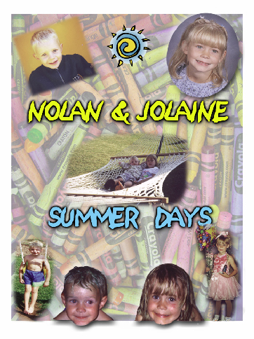
Megan Peterhans
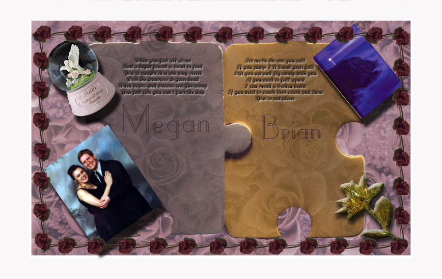
Click on this image to see a larger version. Megan Peterhans is among my most creative students. Her final assignment, a celebration of her relationship with Brian, is absolutely stunning. She uses transparent layers so effectively, and her sense of color is nothing short of first rate. I love the handling of embossing and shadows on the various objects. Megan comes to graphic design from computer programming (she loves it), but it's clear that she has a gift for the graphics.
Jackie Gregorich
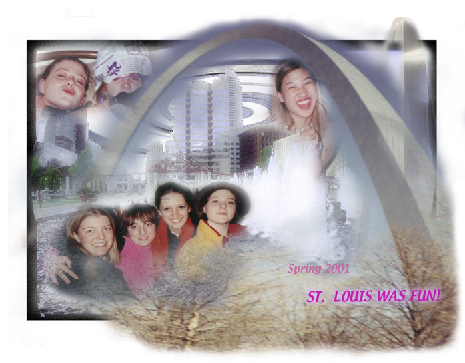
Jackie did a spectacular job here using transparency layers, but also filters and soft borders (blur filters), and I really love how the images flow into on another. It looks just beautiful. I love how she handled the St. Louis Arch in the composition.
Jennifer Christopher
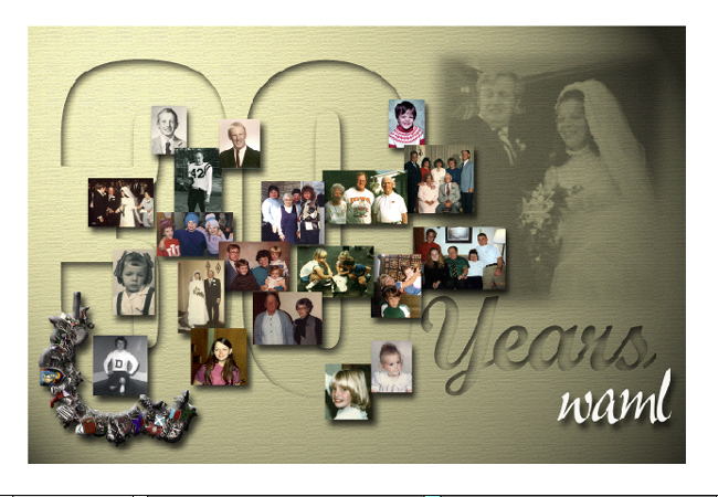
Jennifer could probably make a good living doing this sort of thing. I particularly enjoy the work she did on the charm bracelet in the corner, which she scanned using a flatbed scanner, then she meticulously removed the background using the vector path and magic wand techniques. Excellent job on the individual scans and optimization of the images, too. Some of the pictures were marginal, but she made them better.
Joyce Berendes
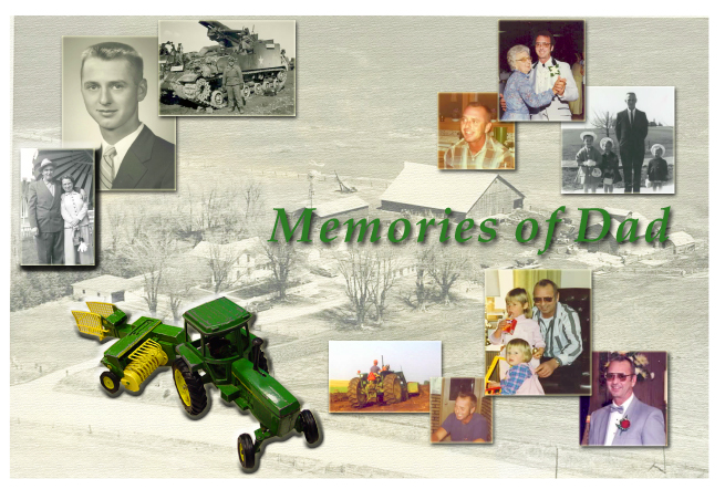
I recommend Joyce do book covers. Isn't this gorgeous? Well, Joyce is in publishing, but she doesn't do craft-type things. Maybe she should. I love the tractor which we photographed right on the desk in class with my digital camera. I particularly enjoy the background on this composition. Good job.
Jennifer Beyerlein
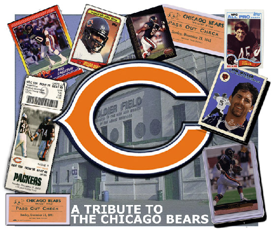
I've had Jennifer in three classes, and she never ceases to amaze me. She could now teach me a few things. I really enjoy how she handled the big C in the middle. It's looks positively three dimensional. She could have a future in sports promotion.
Courtney Hundt
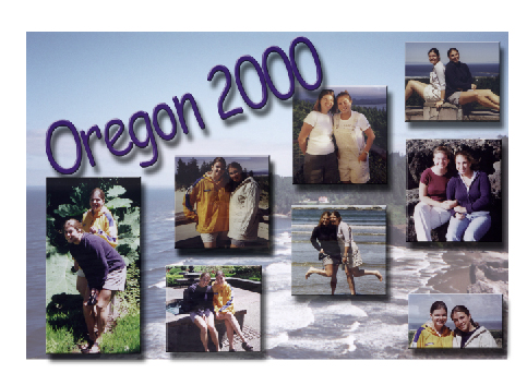
A modest tribute to a trip to Oregon, Courtney expanded an earlier assignment (the Postcard) and turned the concept into a poster. I love the arrangement. It's just perfect for this type of assignment.
Adam Nettleton

Adam got into masking techniques and analogous pixel selection using the magic wand tool She brought in pieces of images not just whole images to create this surreal montage effect.
Tara Griffin

My favorite composition. I recommended she make the pictures appear like they are spilling out of the mouth at odd angles, and I'm glad she followed that advice. Courtney brought the mouth in from a scanned image, I believe, and the rest of the photos were scanned, too. Great job on the embossing and shadow technique. And look how the tongue casts a fat shadow giving it an even more 3D look and feel.
Brian Ernst

Brian is in the construction business, and I supported his choice of subject matter, here, and he didn't disappoint. Look at the meticulous masking around the tools, and the background is sensational. The best part, his drop shadows make the image look like it was photographed as a giant still life. He could use this as an ad, a sign, a business card. Great job.
Jason Betke
Black and white image in the background... not the players are wearing red shorts in stark contrast to the background. How Steven Speilberg! I like how the smaller images are arranged and shadowed. The type has a outer glow that makes it legible. Great job Jason.
Julie Connors
Don't you love this image and what it evokes? I like the variety of imagery, and the background is sensational.
Todd Hittenmiller
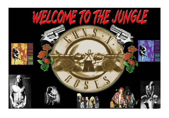
I think I'll put on one of my old Guns-n-Roses CDs while I comment on this. Whoops! Van Helan... that's okay, leave it on. Anyway, I think Tood should be in the CD cover business. This is a very cool poster, indeed. Nice job on the logo, and the red roses, particularly. He excels in colorizing monochromatic images. Very cool. Good job on the type on top by the way.
Nayland Marrero-Alvira
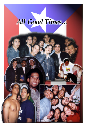
I like what Nayland did here with the flag, particularly. He worked very hard on this. I love the images and how they blend together. He didn't cut them close, just cut them. It looks spontaneous and appropriate for the subject. Great job.
Andy Schroeder
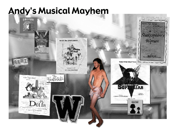
Black and white is all right! But the color figure (that's Andy as JC Superstar), his very cool. I like the background on this because it is black and white and blurred on purpose. This give proper relief and contrast to the images on top. I like the play programs and how they are embossed. Andy, you are too much!
Roberto Marrero-Alvira
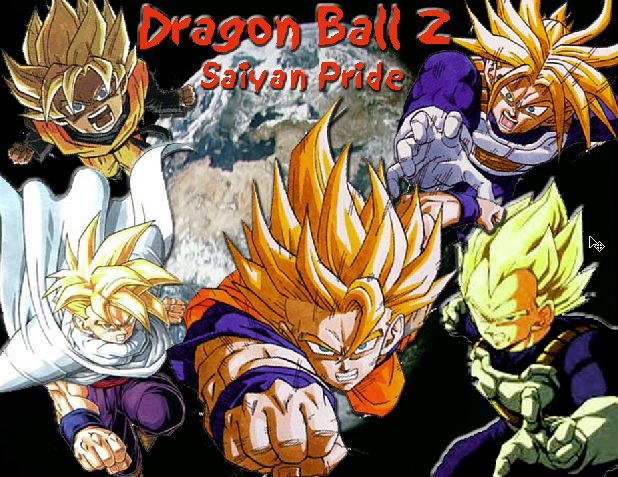
Very different. Roberto chose to do his deal as a celebration of anime charicters. I think this guy has a future in animation or chomic books.
Rebecca Meana

This really turned out nice. Rebecca pulled this off strictly on the classroom computer, and I have to give her credit for resourcefulness. I love the dog! Very nice assemblage of objects, and excellent handling of special effects filters to tie everything together.
Go to Gallery 1, the caricature Assignment
Go to Gallery 2, the Postcard Assignment
This is a Gary Olsen Production
![]()