This is the Brochure Project
To the Newsletter Assignment | To the Poster Project | To the Calendar
This is the new gallery for our students in the Quark Xpress Class, first half of the second semester of 2000-2001 school year. We have a full class and several of the students have taken previous Bootcamps from me, and that's a good thing. There's an expectation level that students understand from previous experiences with me.
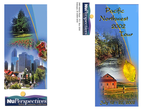
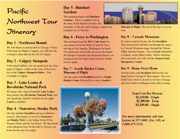
This is one of the best executed projects in the class, and here's the best part... it's a legitimate project which will actually be published! Ann Lorenz.
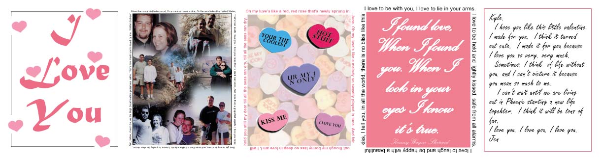
Jennifer Georgen turned her brochure into a unique Valentine.


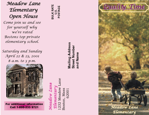
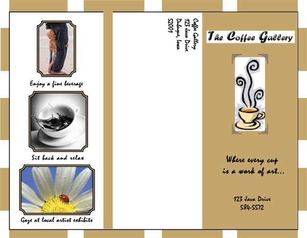
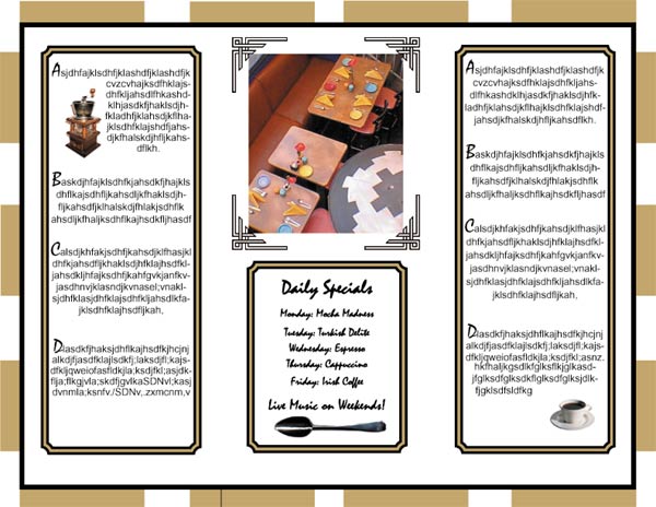
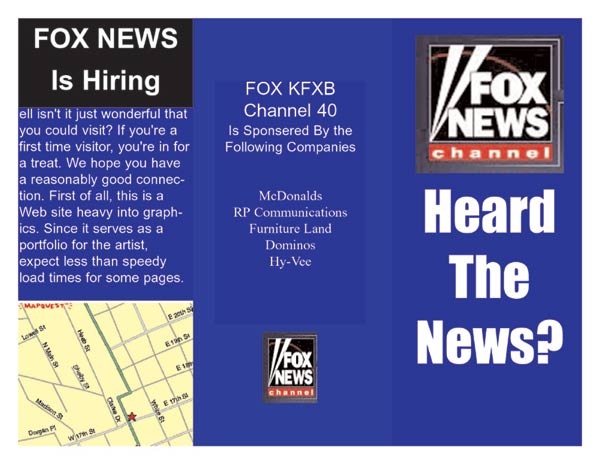
Kay Heller's fantastic Sundown Ski Area brochure.
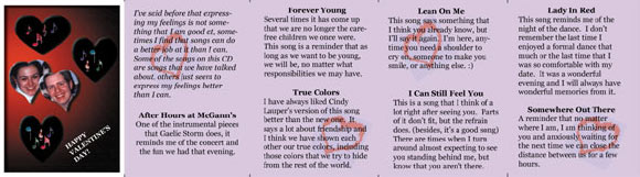
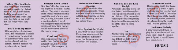
Megan Peterhans unique Valentine foldup.
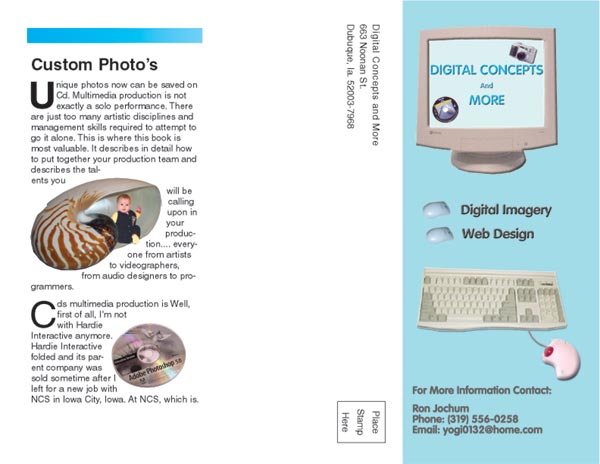
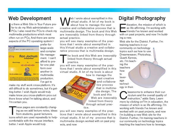
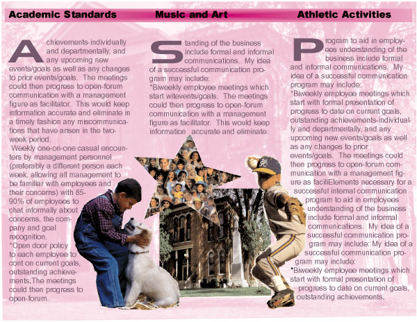
Ron Jochum's spectacular convergence design elements developed from his digital photography, his expertise with PhotoShop and now Quark Xpress is a spectacular example of what this guy has managed to accomplish this year at Clarke. I've had Ron in three classes, now, and he grows with capabilities with every assignment. What is exceptional is his masking capabilities, and text wrapping. The entire vision comes together in a tightly woven layout and Ron's mastery of Quark's many capabilities.
Chris Buss did a fabulous job on this assignment. The masking techique of the images at the bottom of the brochure and the text wrap are masterful.
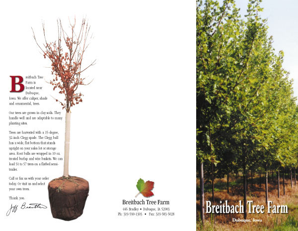
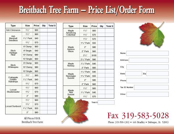
A fabulous brochure executed by Julie Hoffmann. This is not only a wonderfully performed assignment, but this is professional in every way. I know she worked particularly hard on the table. But look at those leaves how they delicately lay upon the background. A great combination of Photoshop elements and Quark capabilities.
This is truly one of my favorite results of this assignment, Chris McClain has emerged not only as a capable operator of such programs as Quark Xpress and PhotoShop, but she seems liberated now to just create interesting documents and designs unemcumbered by a limited knowledge of her software's capabilities. The more you know, the more you can do... it's that simple. That's the goal one wants to achieve. Understand the software so well that it practically does your bidding as you seek to express yourself and give form to your artistic vision.

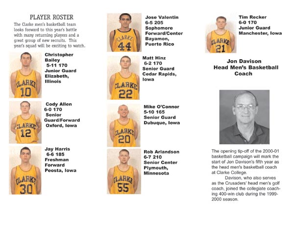
Todd Hittenmiller did this splendid Clarke Basketball brochure. It's simple and a good application of a design grid. But I'm concerned about the fonts. Like that headline that has probably been substituted by a non-variable spacing "courier" face. When you see courier, it's a pretty good indication not all the fonts got included in the final packaging of this design. To be fair, several students in this class have not quite figured this out about Quark despite my nagging about it.

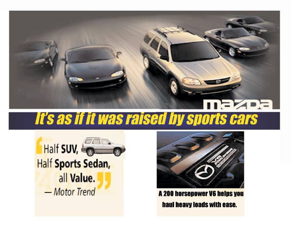
Jennifer Breyerlein continues her Mazda theme. What I truly enjoy about this design is the application of a tiff image in the background upon which she has superimposed type. We learned in class how Quark handles tiff gray-scale images, allowing one to color or tone the image to the desired effect.

Jean Francione. Very nice use of color and type, however, I'm concernd about the crowded type elements especially on the inside. The folds must be absolutely on target or the body type will be in the fold which is something we want to avoid. Also the text is too close to the edge of the boxes since the box contains color and reveals this phenomenon. This, too is easy to correct by merely setting a value of pixels in the offset command in the box attribute menu. Nonetheless, it's easy to correct. Otherwise, wonderful design.
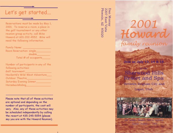
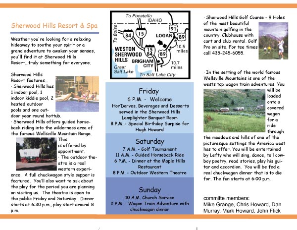
Juanita Chapman did this fine family reunion brochure. Excellent use of type and tints in the text boxes. I also enjoy the test wrapping.
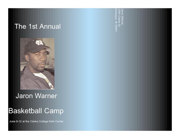

Wow... the use of color and space here are really cool. But I think Jaron got his front page panels reversed. His picture and cover image on the folded section should be on the far right instead of the far left. Easy mistake to make.


Kisa Kotz. This is a wonderfully utilitarian rate card for advertising sales.