Client Page 2
Return to Client Page 1 | Go to Client Page 3 | Go to Client Page 4

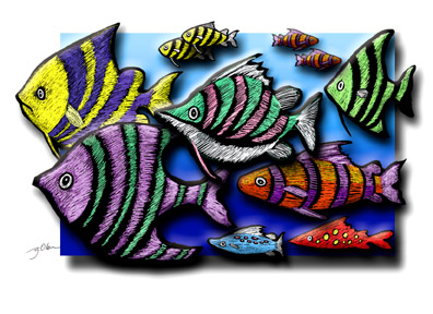
This is an illustration I worked on for NCS Creative Services Department's Open House. A colorful crew! The theme: "Porto-vi-ART-ah! Swim on down to Creative Services."


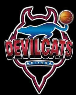
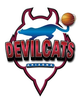
These are logos for a basketball team. One logo is for a home game jersey, the other for away. Typically such logos must work on dark and light backgrounds. We've already dropped the Arizona nameplate from the most recent versions. It just wasn't legible, especially on marketing materials where the logo is reproduced small. Besides, it really wasn't necessary in the final analysis.

Here's a groovy logo I did for a software company. This logo could be easily animated for a software splash page or a Web site, don't you think?
| © Gary Olsen 2016 all rights reserved. All graphics and copy in this Web site are the intellectual property of Gary Olsen and/or his clients' property, used with permission, and cannot be used for any purpose without permission. Address correspondence to olsega@mchsi.com. |