|
Here's the latest color renderings, and I pray you have a well adjusted monitor, now, so you can appreciate them. Since I have a high-end color calibrated monitor (flat screen) that matches printouts perfectly, I feel I've fulfilled your expectations, However, if for some reason, you are looking at these pages with an old monitor (more than 3 years old, the phosphors start to go, and your white screen becomes a shade of blue gray), then there will be differences. However, I've printed out the printable versions (click on the logos below to reveal the larger, printable versions), and they reproduce fabulously. Above is the multimedia version for Web and full color printing applications. Above the flat color version which can be used in spot color applications such as tee-shirts, embroidery, and screen printing on advertising specialties, vehicles, etc. Above is a grayscale version for one-color printing on office forms or newspaper ads.
|

![]() As
you can see, I've already begun the process of updating your logo. And,
as you can see, I did not abandon the colors nor character of your previous
logo. It evokes the same recognition, same visual equity the other logo
has established in the marketplace.
As
you can see, I've already begun the process of updating your logo. And,
as you can see, I did not abandon the colors nor character of your previous
logo. It evokes the same recognition, same visual equity the other logo
has established in the marketplace.
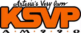
First of all, the colors on this full-color version are a subtle blend of red at the bottom to light orange at the top. The overall impression is orange, of course, but not it's like your logo is glowing hot.
I italicized the logo to give the sensation of speed or movement. Your other logo was fatter, and plump-looking. I also shortened the slogan. You don't really need the word "very" to make your point here. The shorter term makes for a more legible logo. To add the word "very" will mean reducing the overall type size of the line, and we really don't want to do that. This one is streamlined, and with the type at the bottom, it looks like it came from the grill of a '57 Chevy. Yet, it's still modern.
 Finally,
I combined the tag lines "Artesia's Own, and AM 990, and put them
at the bottom to give the logo an overall cohesive look. It's cleaner
this way.
I did some research in Artesia, and learned a few things, toured your Web, and I borrowed some imagery to make the proposed Web banner up top. Hope you like it.
Don't be overly concerned at this point about the costs of reproducing a logo such as this one. Once everything is green lighted, I will provide you with a flat color version for two color reproduction in black and orange. Plus you will get an infinitely scalable version in a file format suitable for creating digital reproductions of your logo the size of an outdoor sign or for vehicle graphics, screen printing, and embroidery applications for apparel.
 |
|
|
Your
current logo
|
Your
new logo (click on it to reveal a larger version suitable for printing
but not publishing). Once it deploys in your browser, right click
on it to download it to your hard drive.
|
What comes next:
If you like what you see, then we can move to the next step which is production quality logos, a complete set for all occasions and applications as mentioned above. The proverbial ball is now in your court. I will be working on the next logo as soon as we've passed the halfway point with this one. I like working on one at a time
Best regards, and a Happy New Year to you all.
Gary Olsen

