

Excellent design by Teresa Meyer for an Awards Program she's involved with.


Prellberg,
Rhonda D. I made this an e-mail link in case you want to
hire her for something. What a talent!
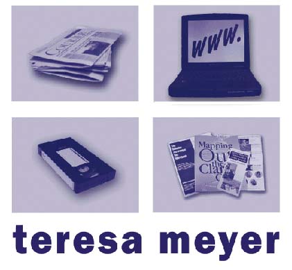
Now
this is interesting. Teresa Meyer is using work samples as her logo. Actually,
this works well in digital applications such as presentations. However,
one must ask, "how well can this be reduced to the size of a business
card? Can we embroider it?
Well, if you are not going to do those things, then the point is moot.
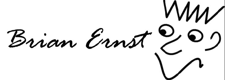
This guy can design your brochure, create a logo and put a new roof on your house. Brian is one of my students from previous classes. We've had nothing but fun. Very talented, and a creative problem solver, too.
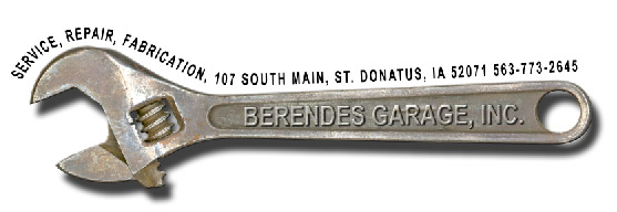
One of my favorites. This is an actual wrench Joyce Berendes brought from home, and with a little PhotoShop magic (she took my course last year), we've got a fantastic logo that can work in black and white as wel as full color.


Card Layout with logo variation
Jennifer Beyerlein's logo is just fabulous. Using negative spaces to create a shape within the middle character is an excellent strategy. The German Shepherd was the best choice for dog profiles. It's strong, associated with rescue, and it works.


The use of his grandson's portrait is a masterstroke of genius. The choice of colors in the line below the name says kids and fun.

Extremely effective juxtaposition of letters and the shape. The concept of one of the shamrock's leaves as a heart is poetic, and I honestly can say I've never seen anything like this until now. It says, "I love Irish!"



Card design
Tiffany Kraemer has submitted two versions of her design, but I have to say I love the black version the best. It's stronger and more legible. The light bulb graphic is very retro, especially with the burst of light shape. Once again, the use of negative shape to create a graphic is very effective.

Loren Heber is a great guy and he's becoming a wonderful graphic designer. He's also a ham radio enthusiast, and this is what he chose to focus on for his self branding exercise. I love the clean look here.