| COMM-280-1 Topics: Web Design & Prod MTH 07:40PM 09:55PM CBH 303 Starts 10/20/03 Ends 12/11/03 | |||||||||||||||||||||||||||||||||||||||||||||||||||||||||||||||||||||||||||||||||||||||||||||||||||||||||||||||||||||||||||||||||||||||||||||||||||||||||||||||||||||||||||||||||||||||||||||||||||||||||||||||||||||||||||||||||||||||||||||||
 It's Assessment Time! An Assessment is just another word for a test, a quiz, an exam, whatever! It's a way I (and the school) can accurately assess what you've learned, apply a mathematical score, and assign you a grade. How else would we know if you're getting the material? The quiz is in Microsoft Word format. Follow the directions: 1. Download the test to a safe spot on your computer, hard drive, or server directory. 2. Fill it out and save it to your hard drive. Don't attempt to fill it out in e-mail. You may lose all of your hard work in the process. 3. Open and e-mail addressed to the instructor, and attach the completed test to it. Do not print, fill out and turn in a hard copy, please. The reason I do it this way is to expedite feedback on your answers. I tell you where you went wrong or right, and this is a valuable teaching moment. It turns the test instrument into something more educational than just a threatening, demoralizing and scary document. You'll see. It's Assessment Time! An Assessment is just another word for a test, a quiz, an exam, whatever! It's a way I (and the school) can accurately assess what you've learned, apply a mathematical score, and assign you a grade. How else would we know if you're getting the material? The quiz is in Microsoft Word format. Follow the directions: 1. Download the test to a safe spot on your computer, hard drive, or server directory. 2. Fill it out and save it to your hard drive. Don't attempt to fill it out in e-mail. You may lose all of your hard work in the process. 3. Open and e-mail addressed to the instructor, and attach the completed test to it. Do not print, fill out and turn in a hard copy, please. The reason I do it this way is to expedite feedback on your answers. I tell you where you went wrong or right, and this is a valuable teaching moment. It turns the test instrument into something more educational than just a threatening, demoralizing and scary document. You'll see. |
|||||||||||||||||||||||||||||||||||||||||||||||||||||||||||||||||||||||||||||||||||||||||||||||||||||||||||||||||||||||||||||||||||||||||||||||||||||||||||||||||||||||||||||||||||||||||||||||||||||||||||||||||||||||||||||||||||||||||||||||
|
For this class, the Web is your textbook. From my point of view, there really is no textbook for Web design because the landscape of the Internet is constantly shifting. But, more importantly, understand that there is no book nor teacher on the face of the planet that could possess more information than exists on the Web. There are two aspects of learning Web design and production: Theory: understanding how people interact with information delivered by a machine. Craft: Learning the software required to build the site. We are going to emphasize the craft more in this class because of its short schedule. However, with every opportunity I will introduce theory and practice issues that are not only applicable, but will be helpful to you as you form your own communication objectives as they relate to the Web.
Here's the squad of Aspiring Web designers:
Domain Registration and Choosing a Host Provider for your Website
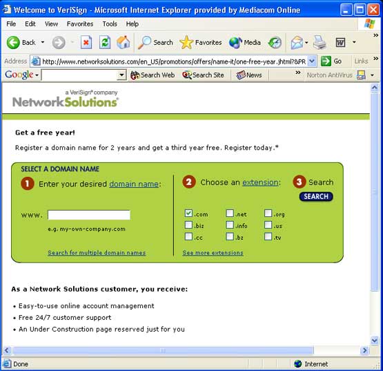
We've negotiated a special low monthly rate with a local company, Net-Smart, in Dubuque, and you can have a website on a solid server accessible by you from any computer in the world for about $16.95 a month with a yearlong contract. If this is too steep for your budget, perhaps you want to team up with another student, form a partnership and split the cost. You can do it among three students, but more than three will make thing a constant negotiation from what to call your partnership to what are you going to use for graphics and navigation? Whatever you decide, I will help you every way I can. But first, we must go through the process of selecting a domain name, and that's best done at the above website, networksolutions.com As you can see by this browser window, you can put in any name you desire to register, and it will instantly scan it's database to see if it matches on already registered. It also gives you suggestions and varations you may consider in the event your choice is already taken.
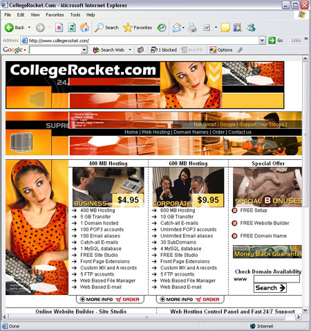
A great local company can also provide you with a complete turnkey web package. CollegeRocket.com is a website affiliated with Dubuque's Net-Smart, Inc. CollegeRocket.com came about as a result of this very class I teach at Clarke College. I soon discovered that hosting websites on the college's web server just didn't work very well. First of all, there is limited disk space on the Clarke server, and the procedure to log on and modify one's web site can be very difficult. It also requires one to have a longer URL address than is really practical. Plus, there is a limit as to how long we can maintain class web sites on the college's server. Furthermore, I beleve it is important these days as a young careerist to have one's own domain and an e-portfolio to aid you in a job search or to just let your freelance customers know what you are cable of creatively speaking, It's just smart to contract with an outside firm that is more reliable in the long term. With all this in mind, I collaborated with Net-Smart, Inc. to form CollegeRocket.com. It's important to point out that I receive no income from this enterprise, though I am compensated in another way by having a greatly reduced price on my personal web sites that Net-Smart hosts, and I maintain my own server at Net-Smart. This company, located at Pennsylavia and Northwest Arterial west of the city, is offering us an excellent low-monthly cost for registering and hosting for minimum one year contracts. So, for under $60 a year, you have a full-fledged website that you can create and maintain continuously with DreamWeaver software or any software you choose. You also have templates available within the CollegeRocket web-based application, however, that's not the objective of this class. We are learning how to create a website from virtual scratch.
Once you've discovered a name that you can register you have some choices to make You will not register your domain with NetworkSolutions yet. Depending on who you choose for a host for your site (like Net-Smart) your host provider will do the registration for you and do a more complete job (they have to register server data such as host address, key personnel who will be the contact person in when it's time for a registration renewal or upgrade, and all of this is best handled by your host provider. Now you can choose any host provider you wish to contract with. It's entirely up to you. But be advised that low price is not the best strategy to find the best provider. You need reliability, no hidden charges, and no surprises. And there is a lot to be said about dealing with a local company if one is available. This way you can develop a relationship with the humans that run the business, and in the event you need support above and beyond the routine, you have someone to call and actually speak to. We're not saying that this might not be available to you from a firm in Cupcake, Utah, but someday you may need something, and you can actually drive to the place that provides host services and maintains your site server. There is some valuable equity in that which is difficult to measure. A Message to Clueless Website Authors Class Assignment #1 Have an idea in mind for a theme for your own Web site development by the end of this first class. This will be an evolving project and half your grade will be determined by your Web site project at the end of term. So, what is your personal Web site going to be about? Be advised, don't get too complicated. As your teacher, I must admit I'm never impressed by complexity but rather simplicity when it comes to creative enterprise. An excellent topic for your Web will probably be YOU. Use this opportunity to build your own portfolio. You won't have to scramble for graphics, and you are your own best subject expert. Our Learning Objectives and Goals: In this class we will l earn how to prototype a Web design and distinguish between Alpha and Beta prototypes and how the help evolve the process of Web development. We will learn how to "Build Ugly" to test useability and functionality, but, more importantly, to reach consensus and approval by those with whom we must collaborate or seek approval. We will make use of a simple program for rapid prototyping (Microsoft PowerPoint). We will learn how to prepare and optimize our graphic files for rapid deployment. We will learn how to create pages in Macromedia DreamWeaver We wil learn how to manage our Web using Macromedia DreamWeaver. We will learn how to distribute a variety of files and multimedia via the Web such as documents, music files, video and audio. I would urge you to bookmark this Web site, however. Many of the discussions and demonstrations we will cover in class will be outlined and described here for your reference.
This week's Tasks: 1. Decide upon our individual website topic. 2. We build an interactive prototype called a "Build Ugly" in Macromedia DreamWeaver. It gives us the ability to build our interactive map and linking opportunities quickly. A "Build Ugly" is simply an interactive group of pages with no graphics or anything except for text placeholders. Very simple, very straight forward, and very quick. This week's objective is to decide our website subject for the entire course. The choice you make this week will stay with you for the duration of the course. Everything you do, and everything you create in class will be for this single subject website. Some suggestions: You can create a personal portfolio (which is what most students do). Or you can create a web site for any topic, subject, passion, or interest you possess. Make your decision within the next 24 hours, please. Learning Objectives this week: You will learn how to organize your site and your workflow. Your workflow is critical in the creative process. You must assess the assets that will go into your site (graphics, text, photos, navigation features, rollover buttons, etc., and organize your site and your computer files to accommodate your task which is formidable. 1. Assessment of graphics for your website includes:
2. Organizing your files for your site (Site Structure) In this context, you will learn what a website looks like in its file organization state.
The way DreamWeaver works is you have two sites... one your creation site or local site, and the other a mirror version of your creation site called your published site or remote site. Your create files in the local site, and you post your completed or modified pages to the remote site with a series of arrow buttons at the top of the site management window. We will open DreamWeaver and begin the process of creating place holder files into our local directory. These will essentially be blank pages that will have at most some text on them merely as a means of tagging them so we know what type of information goes on them.
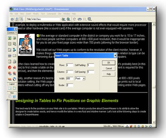
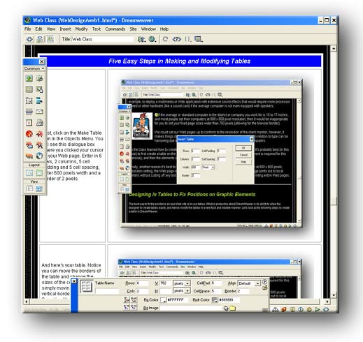
This week we will begin the process of designing our interactive map, page by pasge. We have three learning objectives: 1. We are designing a sample page layout and template which will contain the most common navigational elements and graphics that will establish our site's look and feel. 2. Using Macromedia Dreamweaver, we will use table tools and commands to build a table of rows, columns and cells designed to contain our page elements in position and help build continuity of design in our site. Our objective is to prevent our pagess from deconstructing in various browsers so we must attain harmony with some common design elements. 4. Once our page grid is established, we must begin the production process of organizing and building our page elements, graphics, photos, text elements, etc., and applying them to our grid spaces. Discussion Topic: Designing Tables to Fix Positions on Graphic Elements The best way to fix the positions on your Web site is to use tables. What is productive about DreamWeaver is its ability to allow the designer to create tables easily, and hence modify the tables in a very fluid and intuitive manner. Let's look at the following steps to create a table in DreamWeaver.
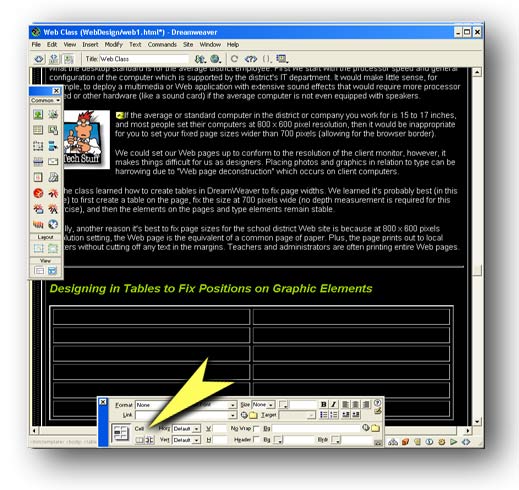
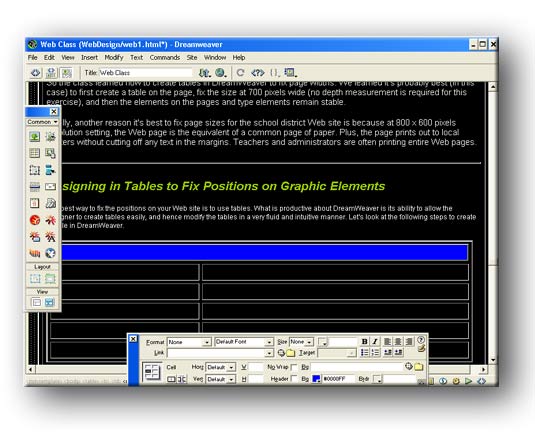
Discussion Topic: The Importance of Designing for a Common Denominator or "Why it's important to design with Tables on your web pages." Designing for a common denominator means we are considering the screen size, browser preferences, processor speed of the target computer. For example. If I'm designing a Web site for school district employees, I should know what the desktop standard is for the average district employee. First we start with the processor speed and general configuration of the computer which is supported by the district's IT department. It would make little sense, for example, to deploy a multimedia or Web application with extensive sound effects that would require more processor speed or other hardware (like a sound card) if the average computer is not even equipped with speakers.
We could set our Web pages up to conform to the resolution of the client monitor, however, it makes things difficult for us as designers. Placing photos and graphics in relation to type can be harrowing due to "Web page deconstruction" which occurs on client computers. So the class learned how to create tables in DreamWeaver to fix page widths. We learned it's probably best (in this case) to first create a table on the page, fix the size at 700 pixels wide (no depth measurement is required for this exercise), and then the elements on the pages and type elements remain stable. Finally, another reason it's best to fix page sizes for the school district Web site is because at 800 x 600 pixels resolution setting, the Web page is the equivalent of a common page of paper. Plus, the page prints out to local printers without cutting off any text in the margins. Teachers and administrators are often printing entire Web pages.
Here are your specifications: 1. Your maximum size page will be 800 pixels. All banners for pages must not exceed 800 pixels (they can be less... they just can't be more). Why? Because the size of graphics on a page if not to precise specifications, will negatively impact all other graphics and tables on a page. 2. You must determine the size of individual graphics, icons and buttons that will comprise your site. For example, if you are to have thumbnail photos that will serve as links to larger images the user can download, all photos should be a uniform size. They can be different sizes, like a small, medium, and large size, But your largest image should equal two of your smaller images size by side. In other words, if you are going to feature photos on a page with three columns, and two of the columns total 510 pixels wide. You can combine two cells of a column to display one photo 500 pixels wide, and to images below can be 250 pixels each. When the two smaller photos are placed in a row beneath the larger image, the total width will be 510 pixels. 3. You must design your page grid. What will go where in your page template? Will text always appear in the far left colum? How many buttons will I have on a page? Will I have a navigation bar? Will the buttons spread across the top of the page or down the side?
This approach to asset management and design specifications for your website's elements will allow you to assemble a page design that will not deconstruct upon its display in 99% of the web browsers in use today. The grid above is 700 pixels wide, the width of our page specification. It contains three columns. Remember: If any of your page images exceeds the specification, and the total length of the objects in that grid exceed the maxium width of the grid, the entire layout will come apart because it will push the table geometry apart. You will be learning about how tables, like the one above, helps keep your page assets in their proper place on the page, or at least where on the page you intended them to be displayed. Another Page Grid Suggestion:
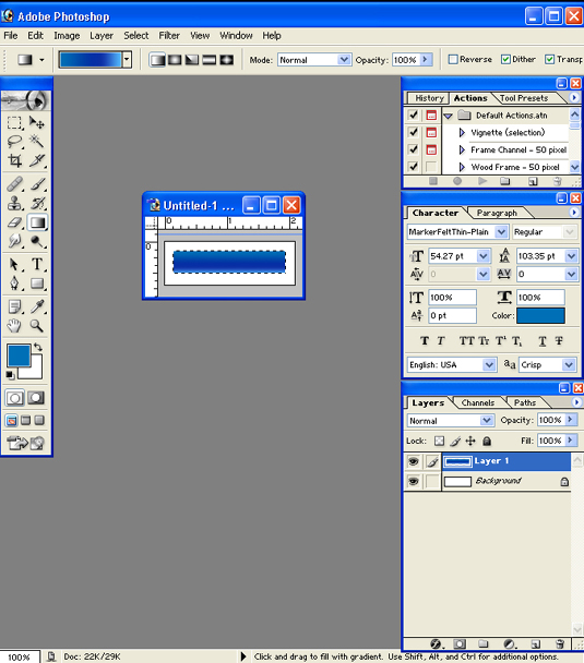
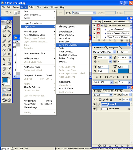
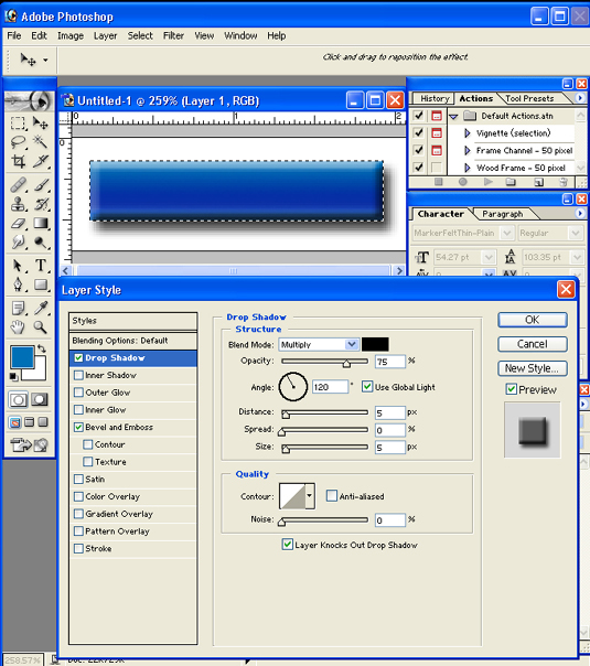
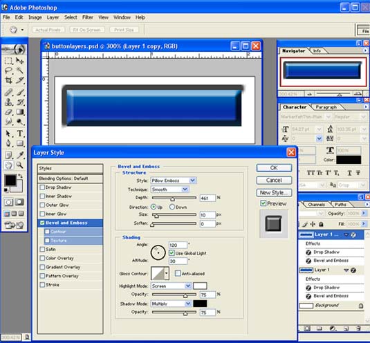
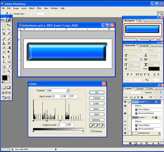
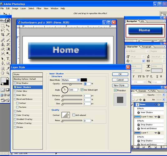
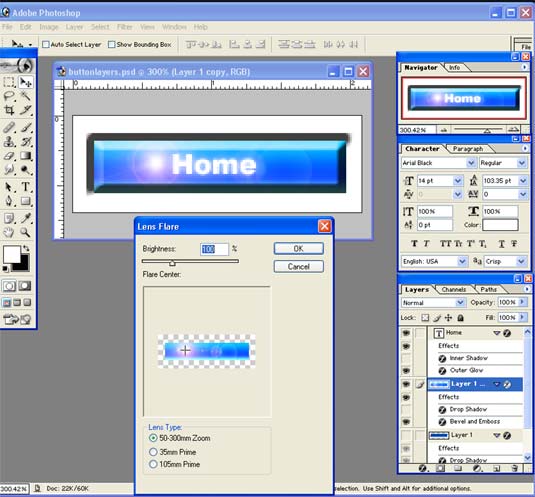
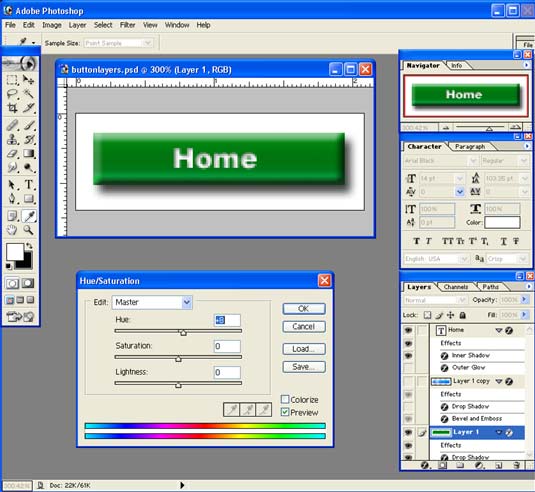
This week's objective is to begin the production process of the individual page elements. These include buttons, photos, page graphics and banners, icons. We have three learning objectives: 1. Learn how to build a page banner master file in layers using Photoshop. In this lesson we learn the importance of building a graphic template to maintain size and aspect ratios. We learn about color palettes and the importance of selecting the right color combinations for maximum visual impact. 2. Learn how to build rollover (two stage) buttons for navigation. Using Photoshop, we learn how the bevel and emboss tools and drop shadow tool to create the kind of effect we desire. We learn how to build a button graphic template to maintain specific size and aspect ratios.
Class Discussion: PhotoShop: Adobe's Swiss Army Knife for Web Development Even if you can't draw, take a picture you feel is of artistic merit, PhotoShop will be your most valuable ally. It is not just a photo manipulation software program, but a production tool that enables you to optimize graphics which are to be deployed on the Web. Everything you create graphically, or obtain from other sources, will have to go through PhotoShop eventually. You will want to resize, modify, reduce, and perhaps composite the image with other images. In any case, you can do these things most effectively in PhotoShop. Adobe's PhotoShop has been around for more over 15 years. It started out as a photo manipulation and image creation program for the Macintosh in 1986 with the evolution of Apple's color version of the Mac. It helped Apple Computer dominate the graphic arts industry. As computers became more powerful, and desktop publishing became a print-industry pre-press design and production standard, Adobe's PhotoShop evolved and became even more powerful, not only on the desktop, but in the marketplace. And even though a PC version of PhotoShop was released shortly after the introduction of the Windows operating system, the loyalty to the Macintosh was so profound, that even today, the Mac dominates the design field by a significant margin. However, this margin has begun to erode as PCs have become more powerful and equal to the task of design. PCs have always been more competitively priced, but PCs lacked the array of color management software that were long a staple of the Macintosh world. The world of graphic design has shifted from a business model that stressed publishing, to one that is now best characterized as "multimedia." And when we speak of multimedia, we are talking about the Web. The Internet is a veritable stage for multimedia content. And PhotoShop has evolved, too, from a print-centric program for desktop publishing, to a multimedia development tool for producing Web graphics and graphic elements for 2-D and 3-D animation. So, besides your Web creation tool, which can be DreamWeaver, FrontPage, Cold Fusion, et. al., perhaps most essential in your arsenal of capabilities is your facility with Adobe PhotoShop.
Class Discussion: Macromedia DreamWeaver - Establishing the Standard for How Webs are Designed and Managed Macromedia DreamWeaver has emerged to dominate the Web creation market. It's more difficult to trace the history of this product compared to PhotoShop's more visible rise to dominance. The Web evolved so rapidly, and so many people embraced DreamWeaver (estimates say currently 75% of all Webs are built with a DreamWeaver product either Ultra-Dev or DreamWeaver), that it seemed like suddenly, this was the program to have. For a time, Microsoft and it's FrontPage product looked like it would emerge as the WYSIWYG Web tool of choice after some months of building Web pages by HTML editors (not for everyone), and DreamWeaver was just part of the pack. Then something interesting happened. Macromedia decided to build a better program than what was currently out there (which wasn't much), and the business model would involve the Web community itself as the co-authors of the program's most functional features. You can go to the Macromedia Web site, for example, and download all kinds of free (and low-priced) program aplets that enhance the productive nature of DreamWeaver. Like, if you want a code macro to build certain navigation functionality in your site, like a hit counter, you can download one that works like a charm right here and right now. No other software developer ever worked this way with its customer community, and it soon won a huge following of collaborators. The other feature of Macromedia DreamWeaver that was so wonderful to developers was its ability to generate clean code with none of the non-HTML code variations one would find in products like FrontPage, which had too many hooks to Explorer browser-only features that penalized you when troubleshooting your pages in NetScape. And this may seem trivial to some, but not to a Web designer: Rollover Buttons are easier to create in DreamWeaver than anything else. People love Rollover buttons. DreamWeaver has a wonderful user interface, but it requires a large monitor to see everything well. More on these details in class as we review the programs features. How Macromedia DreamWeaver works... an overview: Software Setup: Note: On these screen shot illustrations, just click on them to see an enlarged view. Macromedia DreavWeaver manages your Web site as if it was a large database, and Macromedia DreavWeaver is the dashboard (or user interface). Macromedia DreavWeaver has an excellent page creation tool. Macromedia DreavWeaver allows you to build forms, include multimedia files and combine all manner of multimedia content. Macromedia DreavWeaver is flexible enough that you can tailor the Web creation process to suit your particular needs.
There are actually Two Web Sites in Your Life: You want to avoid working on your live site. Instead, you work on a "practice" site or "Development" site. The Development Site: The Development Site is where you actually work on your pages, create or edit links, add or remove files, generally maintain your site. This is where you test your functionality of changes you've made to your site. Once finished updating and checking, you are ready to publish your site. The Publish Site: This is your Publish Site where you post your site once changes have been made. It's most common for Web masters to have their Development Site on a seperate file server. The Development Web is then transferred, using built-in TCP commands or a simple mapping of a nework drive, to the Publish Site. This server may be outside of a network firewall, for example, to protect your Development site (which is likely on a LAN) from intruders, unauthorized entry, viruses, etc. Review of software features...
Review Student Alpha Prototypes... and a discussion of the design process The theme for this class is "Build Ugly." Web design and development is a very collaborative process, involving many different creative people (including the customer), and many different disciplines (programmers, artists, musicians, photographers, videographers, graphic designers, instructional designers, etc.) all of whom have ideas (good ones, of course) and possibly agendas. One of the most common mistakes a Web designer can make is to get too far afield with a look and feel that may be unworkable in a functional sense. A key Web designer strategy is to reach consensus, seek to approve incremental development of the project as work proceeds, and move on toward a productive outcome. Sometimes the designer wants to build momentum with a client, figuring if he or she "sees all this work I've done, they'll be less inclined to want to make changes." Then, when the client demands a change, having to rework the change into all the work that has been done becomes a time-consuming, money losing train-wreck.
The time you can spend in design before you actually produce the work is time well spent. In fact, I try to anticipate and plan for 75 percent of my time invested in design, and 25 percent of my estimated time in production. Design time is relatively less costly than production time. What you want to avoid is having to do things over and over again. Because Web site development is multimedia and a highly technical enterprise (a blend of art and engineering), you must consider your site's interactive information design and how people (users, visitors, et. al.) will respond to your information design. Your interface design is crucial because it must work on two levels. You Web design should provide a viewfinder to your information, and it should also have an intuitive design that invites users to stay and retrieve more information. Your interface should automatically teach the visitor how to use the program through intuitive conventions such as rollover buttons, hyperlinked menus, navigation bars, and it all combines to create one complex network of information. This is why an alpha test of your interactive design is important and useful. Not only is an alpha design (or what I call a "build ugly") valuable as a way to collaborate on your Web's functionality, but it provides an important opportunity for your client and colleagues to approve the work at key incremental levels. Plus, and this is the best part, it provides a splendid opportunity for everyone to make suggestions, voice considerations, and offer ideas that will likely make your Web better! So, in this class, we began to build ugly our interactive designs we prepared before this class.
Class 5:
We open Macromedia DreavWeaver and begin building a page. We open the HTML source code and examine the most basic of html commands. We work in WYSIWYG (what you see is what you get), but we fine tune our work in the HTML source code window. Demonstration Topic: My First Web site, cattracker.com
Class 6 Discussion Topic: Using the Web to distribute something other than HMTL. You can use the Web to distribute all manner of documents. You can distribute: Documents (Word files, Excel, Acrobat files, etc.). Just put them in a directory in the site, and create links to the files. When the client clicks on the link, it recognizes the extension (.doc, .pdf.) and it launches the application or helper "plug-in" that allows the file to be viewed and edited. Multimedia files, such as sounds or music files, even video clips, can be put in a directory, and you merely link to them. However, the client must have the appropriate multimedia plug-in or player to launch the file. If the client doesn't, his browser will endeavor to identify the type of file attempting to download, and immediately link to the appropriate site to allow the client to download the player (RealMedia, Media Player, Apple QuickTime, etc.). Demonstration of file download opportunities on the Dubuque Schools Web: www.dubuque.k12.ia.us Class 7 Building Our Beta Prototype in Macromedia DreamWeaver
Let's begin building our Beta in Macromedia DreavWeaver. In this section, we "Build Ugly" our web pages in Macromedia DreavWeaver and create links and placeholders on our pages. Class 8 Preparing Graphic Files for the Web What we are going to learn today is perhaps the category of tasks associated with Web development that consumes the most time, energy and resources... Graphics! The Web, by its nature, is a graphical environment. For 25 years, preceding the invention of the World Wide Web, the Internet existed as a largely text-only communication network which was sponsored by the government and developed by research institutions (of higher learning) who needed a means of exchanging large amounts of digital research data between main-frame computers. In fact, for more than half of its life, the Internet existed without personal computers on its network. When personal computers did come on the scene in the mid to late 1970s, it was only natural for scientists and researchers who were using these wonderful tools, to want to hook them up to the network to exchange data. It would be more than decade later that the means for transferring page description language would be invented to allow the transfer of pictures, graphics and other interface items that were now commonplace on personal computers in other programs. The Web was neither hatched or was born in the literal sense. That implies the Web was the brainchild of too few individuals. It was actually the result of a natural evolutionary process that started a long time ago. As the Web evolved quickly, it borrowed liberally from other visual media forms, adopting and adapting conventions that were pioneered in the television industry, desktop publishing, and interactive forms of entertainment such as games and CD-ROMs. The Web is the world's largest work in process. It involves a lot of different talents and collaboration to grow into its many new possibilities. Programmers can build a network and a Web, but few can draw or design attractive pages. Artists can design attractive pages, but may know little of the programmer's realm. This we know for sure... graphics are the fuel of Web content. The consumes them in enormous gulps. If there was a golden age of illustration in the days of The Saturday Evening Post, the the Web and today represents a golden age for graphic designers.
1. The browser technology deconstructs your beautiful pages. It is almost impossible to predict the outcome of every html page you design in every computer, browser configuration or platform your page will be viewed. This is because the Web and the personal computer is all about user preferences. This is why they call computers "personal." Because the user can control most events on one's screen, set preferences in the browser menu, and change the screen dimensions of one's display, trying to control the look of your page as a designer becomes an exercise in futility. 2. Low resolution graphics mean speedy graphics that can be dispatched over slow or busy networks. Print people hate low resolution, but they are still in the print world. Most graphics deployed on the Web are not meant for print, nor will they ever see a printed page. Get over it! The resolution is 72 dpi! Relative size of your image depends on how much of the screen you want to occupy. If you make a graphic larger than 700 pixels wide, it will be cut off by the browser on 95 percent of the computer screens out there who set their screen display at 800 x 600 pixels! But it's file size that is the boondoggle of Web performance. A large colorful graphic might look nice on the desktop, but sending it over a network is like sucking an elephant through a soda straw. Discussion Topic: Resolution and Image Size On the Web, 72 dpi is the equivalent to how graphic images are rendered on your display. In publishing, resolution is much higher because on the printed page the pixelmap that renders the image is more obvious to the eye. Hence resolution of an image destined for the printed page must be a much higher resolution rendered to a much smaller pixelmap. This small pixelmap allows for the anti-aliasing of pixels along high contrast edges and curves to mitigate the problem of jagged lines and artifacting (the obvious display of pixels on the page). Anti-aliasing is accomplished through the use of contrasting colors that blend enough to obliterate these jagged lines. The denser the pixelmap and the smaller the pixels, the less possibility there is of detecting these jagged pixels. On
computer screens on the Web, however, all graphics are displayed
at 72pi. If you were to accidentally save a 300 dpi graphic to your
Web page, it would display four times larger on your screen. It
would be like looking at your illustration through a keyhole. This
is because the browser technology only supports a pixel resolution
of 72 dpi, and an image that is 300 dpi displayed at the resolution
will be enormous and off the edges of the browser window. Discussion Topic Color on the Web Colors
are critical in the performance of graphics. There are two conventions
in use on the Web as far as bitmap images are concerned (there is
a third... vector graphics... which we'll discuss later). Below
are two windows from the popular program, PhotoShop, which illustrate
the program's Save for Web feature. What Save for How do JPEG images work? Unlike gifs which merely limit the number of colors of your graphic and uses a dithering technique to interpret the color gradation (causing banding and pixelization), JPEGs or JPGs use an equation to interpret the colors of the image and compress them in a way that limits the loss of color. JPGs, instead of sending limited colors through the wire, tell the computer's operating system via the browser on the client's end of the wire to use its native color palette to paint the image using this specialized color palette. The compression may be severe or slight depending on how the designer set the compression scheme. Less compression means lossless compression and a better image. Too much compression makes a smaller file size, but the image gets blotchy and artifacty as we say... errant pixels muddy up the skin tones of a face, and reds, particularly don't render well. In any event, working with JPGs often make for smaller, faster and better looking images, particularly photographs. Graphics, on the other hand, that have inherent limited color schemes, can be better served by GIF compression. Here are two identical photos one saved as a GIF with as few as 8 colors, and the other a JPG saved at 50 percent compression. Right click on the files and examine the properties for file size.
Class 9: Working on our Look and Feel We will work on a title bars and buttons. What is critical in this portion of the training is Uniformity of sizes Creativing graphic templates in Adobe PhotoShop How to opimize our graphic elements for rapid deployment. Using the Save for Web function of PhotoShop.
Class 10: Working Page Layout: Working with Tables and Deconstructing Page Layouts. Tables are really the only way you can ensure that objects you have placed on your Web pages will appear in approximately the same place in the page that displays in the viewer or on the client's computer. If you are coming from print design, where you have complete and utter control over element position on a page, you're going to not like Web page design very much. You will constantly do battle with the deconstructing page... the page that looks terrific on your computer but looks nothing like what you designed on the client's machine. Tables help mitigate this somewhat, but there are still surprises you will have to deal with. Let's look at what you can and can't completely control in your page layout:
The fonts are listed in order. For example, when you select Arial, your page will tell the client's browser to choose Arial first, then look for Helvetica, and then (if those fonts are not resident and available on the client's machine, any sans-serif font will do Select Times New Roman, and if that's not available, the browser will select Times, followed by any serif type, and so forth. What do most Web site designers do if they want to use a specific font on their page that simply is not available on client machines? The designer will make a graphic out of the type element.... turn the type into a jpg or gif graphic image, which is not without compromises.... you can't easily edit the type, and the graphic elements now represent more bits and bytes of information that must be stored and distributed thereby impeding performance of your Web pages. 2. Tables don't behave exactly the same way in every browser. But they do behave predictably well, and they are fairly easy to create and troubleshoot. You can put color in table cells, for example, but in some browsers, the colors may not appear. I put a table with an off-white background color in the cells, and I had a black page background. A problem persisted in Netscape browsers where the black type did not appear in the table. It appeared fine in Explorer. It was a vexing problem, and taught me an important lesson: keep it as simple as possible. You can make a complex design execute simply with good planning. 4. Tables are not Fixed Widths no Matter How Hard You Try: Tables won't stay at the size you create them. Let's say you have a 700 pixel wide page table. If you have graphics in all three columns, and the total width of all three graphics exceed the total maximum width of the table, the table will expand (widen) to accommodate the width of the graphics thereby blowing your page apart.
Above everything looks hunky dory... a 600 pixel wide grid, with three equal spaces or columns. Let's put in three graphics.... two are 250 pixels wide, and one (the middle one) is 175 pixels. Not only are the columns out of balance, but the entire grid has grown by almost 100 pixels. So what would you begin doing in your workflow of graphic production to avoid this problem?
4. You can fix table cell widths (columns) by using tables inside of tables. Sometimes tables collapse if you don't have a graphic element of appropriate size in the column. This is problem is transient and is caused by how different browsers handle table and cell dimensions. For example, if you don't put anything in a table cell, the cell and its background color will be completely absent in certain browsers. Here's a way to prevent table collapse.
5. Okay, I know how to position things vertically, but how about horizontally?
|
|||||||||||||||||||||||||||||||||||||||||||||||||||||||||||||||||||||||||||||||||||||||||||||||||||||||||||||||||||||||||||||||||||||||||||||||||||||||||||||||||||||||||||||||||||||||||||||||||||||||||||||||||||||||||||||||||||||||||||||||
 elcome
to Web Design Class at Clarke College. I'm your instructor, Gary
Olsen.
elcome
to Web Design Class at Clarke College. I'm your instructor, Gary
Olsen.


 Everyone
in this class will be required to establish a legitimate web domain,
preferably in your own name. If your name is taken, we must endeavor
to find a variation that makes sense. You are building a personal
portfolio that will help you get a job.
Everyone
in this class will be required to establish a legitimate web domain,
preferably in your own name. If your name is taken, we must endeavor
to find a variation that makes sense. You are building a personal
portfolio that will help you get a job.
 CollegeRocket.com
 Nonetheless,
you should register a domain name at the very least. You don't have
to establish a website in this class. It is not a requirement, but
if you can swing it, this is the time to do it when you have direct
supervision and the best coaching available to build your very own
domain on the web.
Nonetheless,
you should register a domain name at the very least. You don't have
to establish a website in this class. It is not a requirement, but
if you can swing it, this is the time to do it when you have direct
supervision and the best coaching available to build your very own
domain on the web.
 If the average or standard computer in the district or company you
work for is 15 to 17 inches, and most people set their computers
at 800 x 600 pixel resolution, then it would be inappropriate for
you to set your fixed page sizes wider than 700 pixels (allowing
for the browser border).
If the average or standard computer in the district or company you
work for is 15 to 17 inches, and most people set their computers
at 800 x 600 pixel resolution, then it would be inappropriate for
you to set your fixed page sizes wider than 700 pixels (allowing
for the browser border).  Photoshop
is an essential tools of the Web developer. This week, you will
begin collecting and creating your assets for your website. But
before you can begin working on your images and page design, you
must determine what your page geometry is going to be.
Photoshop
is an essential tools of the Web developer. This week, you will
begin collecting and creating your assets for your website. But
before you can begin working on your images and page design, you
must determine what your page geometry is going to be. 3.
Learn how to build icons, small graphic elements used to decorate
a page. As in the previous two learning objectives, we are going
to pull graphic resources from a variety of locations including
the web, clip art and create our own using a digital camera.
3.
Learn how to build icons, small graphic elements used to decorate
a page. As in the previous two learning objectives, we are going
to pull graphic resources from a variety of locations including
the web, clip art and create our own using a digital camera.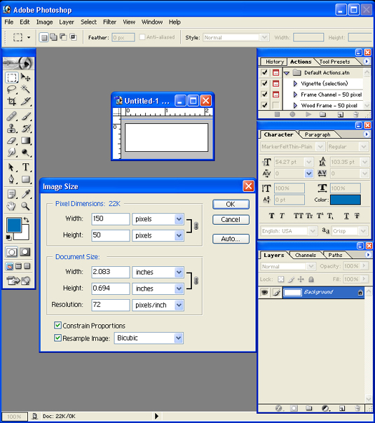


 In
Web design, you simply must organize your workflow, from design
through production. You have difficult-to-calculate number of graphics,
content and God knows what else that will populate your Web site.
My experience has shown that graphic design and production alone,
consumes the largest block of time.
In
Web design, you simply must organize your workflow, from design
through production. You have difficult-to-calculate number of graphics,
content and God knows what else that will populate your Web site.
My experience has shown that graphic design and production alone,
consumes the largest block of time.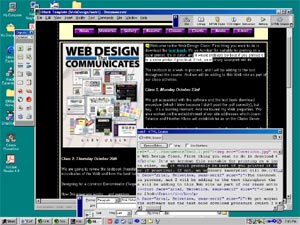 HTML
in Depth...
HTML
in Depth... 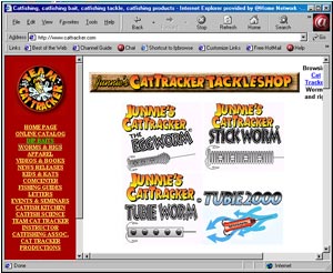 My
first Web,
My
first Web, 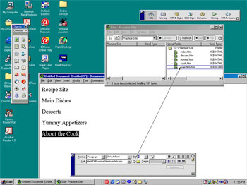 You
can build a rapid prototype in Macromedia DreavWeaver. An example
is at right. One of the fastest ways to compile a brace of pages
is to simply open new pages and save them using the names of your
first page's navigation or subtopic list. At right, I am working
on a recipe site which features four subtopic pages, Main Dishes,
Desserts, Yummy Appetizer, and an "about the cook" section.
Once all of my blank pages are in the directory, I can select my
main page, or index page, where I begin building my navigation.
You
can build a rapid prototype in Macromedia DreavWeaver. An example
is at right. One of the fastest ways to compile a brace of pages
is to simply open new pages and save them using the names of your
first page's navigation or subtopic list. At right, I am working
on a recipe site which features four subtopic pages, Main Dishes,
Desserts, Yummy Appetizer, and an "about the cook" section.
Once all of my blank pages are in the directory, I can select my
main page, or index page, where I begin building my navigation.
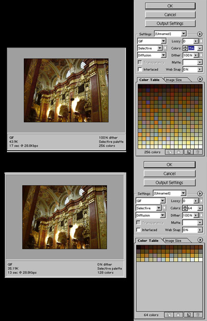 Web
allows you to do is view your file in a variety of limited color
formats, jpg (which is compressed full color images), and GIF which
is limited palette images. But below, we are saving the image file
in two different GIF files, one is 256 colors and the other is 64
colors. Note that there is virtually no difference between 256 and
64 colors of this image in terms of quality, The big difference?
The smaller color palette graphic downloads in half the time of
the other image at 256 colors. This is a crucial point in Web graphic
production. Less is often more. The user doesn't recognize a high
res graphic from a low res one. If the image is good in the first
place, was scanned properly, and reduced to a comfortable size,
it will look terrific.
Web
allows you to do is view your file in a variety of limited color
formats, jpg (which is compressed full color images), and GIF which
is limited palette images. But below, we are saving the image file
in two different GIF files, one is 256 colors and the other is 64
colors. Note that there is virtually no difference between 256 and
64 colors of this image in terms of quality, The big difference?
The smaller color palette graphic downloads in half the time of
the other image at 256 colors. This is a crucial point in Web graphic
production. Less is often more. The user doesn't recognize a high
res graphic from a low res one. If the image is good in the first
place, was scanned properly, and reduced to a comfortable size,
it will look terrific.

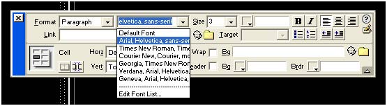 1.
Fonts: The fonts on your computer are not the
same ones on your client's computer, and there is no practical way
you can transfer the type you want to use in editable text. But
you do have some creative potential. This is the font list of available
core fonts on most computers in the Western world.
1.
Fonts: The fonts on your computer are not the
same ones on your client's computer, and there is no practical way
you can transfer the type you want to use in editable text. But
you do have some creative potential. This is the font list of available
core fonts on most computers in the Western world.