Welcome to the Quark XPress Bootcamp Student Gallery!
Poster Assignment
See these other project galleries:
Newsletter Assignment | Brochure Assignment | Calendar Assignment
Photoshop Class Student Gallery
 First of all, these are images of the actual Quark XPress files the
students prepared in class. The students saved their pages as EPS files. The images were
then imported into Photoshop where the students could optimize them for Web display. The
files were saved as JPEGs.

This is a splendid composition with some very complex masking of overlaid images. Angie Klein did a spectacular job on this assignment. She even reworked some of the low res graphics she had to deal with in PhotoShop.

Ardell Sander's very classically designed poster features some memorable images of Michael Jordan. The vertical type is pretty interesting. Ardell designed this poster in just minutes and demonstrates his near mastery of Quark as a design tool. Now he's learning about Quark as a production tool.

What can I say but WOW! This poster is nothing short of spectacular. As an example of Quark's ability to layer variously shaped masked objects, Kelli Clark put Quark to the test. That basketball, by the way, started out in black and white. A quick in-class PhotoShop lesson on how to colorize monochromatic images solved that problem.

Dennis Frank is one of my students from last semester's Advertising Design Class (see more of Dennis' work by clicking the hyperlink.) Dennis has a well-developed sense of composition. Dennis went ahead and purchased Quark Xpress for his home PC. With the student discount, it came to $295. This is fantastic considering Quark costs nearly $800. Obviously, we expect big things from Dennis as the semester continues.

This arresting image was created by Juan Salazar. Srong contrasts, vibrant color, and the off-to-the side positioning of type, are interesting. I particularly enjoy the intentional lack of balance that gives the entire image a naive, folk-art quality.

This poster is not only a splendid composition and assignment student Jackie Ricke was required to do for class, but it's a legitimate project for an event she's planning. A wonderful use of borders and using a monochromatic image for texture in the background. Jackie is one of our students from neighboring Loras College.
Image Not Available (sorry)
Heather Kloss is a photographer, and she used this assignment as an opportunity to advertise on her poster. Excellent job, and don't you just love the message, here? She has a future in copywriting as well as photography and design. She's a triple threat.

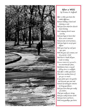
An original poem and photograph makes for a poster suitable for framing from Charmayne McMurray. Strong composition, here, and excellent use of type style and borders. What's remarkable is that this Quark document is comprised of only two frames, one for the image and one for the type and border. Terrific!

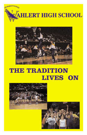
Beth Eggers popped some personal photographs onto the scanner, brought them into Quark against a frame with just the right yellow in the background, and floated the colored type elements and scanned logo at top in separate overlayed boxes. Great job (and delightful photographs, too)! Do you think she's on the Booster Club?
View the Newsletter Gallery! | View the Brochure Gallery | View the Calendar Project
Credits: Certain images used in this class by the students have been appropriated from various media sources but for instructional purposes in a purely educational environment. In no way are these images being exploited or published for commercial or personal gain. The display of these images in this website are for instructional purposes only, and source credits for the images will be listed in detail whenever possible.