
| This leson and assignment is designed to teach image compositing and successful integration of graphic elements from different sources. | See Student Caricature Gallery | |
|
Meet Kate One of my students graciously allowed me to use her visage for this quick little lessons on image compositing. I photographed Kate with a fairly direct light, but the exposure is overall excellent. In other words, I can manipulate the image sufficiently to create a very modeled look despite the absence of professional photo lights.
|
||
|
What a Great Poster! I found this fabulous photo of a Laura Croft Tomb Raider poster. The trick will be to match the skin tones, head position and size with the head of the actress in the poster. There's just so much you can do manipulating pixels in the portrait above. Using the hue, saturation, or color manipulation tools can ruin the image or over saturate dark pixels. I've got a better plan. It will require a more radical touch-up technique that will involve layering and underpainting. But like I said before, we have an excellent portrait to work with, and this will help a lot. |
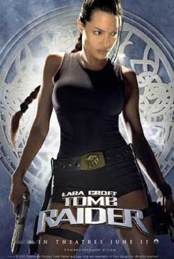 |
|
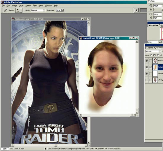 |
First, I take the picture of my student, Kate, and position it on the desktop near the target image file. This way I can match my colors, even draw color from portions of the poster. Underpainting The next step is make three layers in the portrait file. The top layer is my student's face, the layer of which I set from Normal to Multiply in the layer properties menu. This puts the face on a completely transparent layer. I can now use my paint sprayer and tint the layer beneath the face and model the color the match the poster. This is fun. I have a layer of white beneath the layer I'm spray painting so I can see an accurate portrayal of what I'm doing. It's like painting from the inside out. But because I don't touch my top image layer, the details remain intact. I even oversprayed to show precisely how I layer the paint... I'll of course trim off that area around the head when I'm ready to move this image into the poster image. |
|
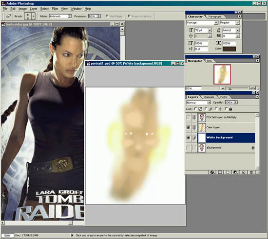 |
I clicked off the top layer to see my tinted layer beneath, and it looks spooky. But I have it matching the skin tones in the Laura Croft poster exactly. Not that I erase the whites of the eyes, and I tinted the highlights slightly yellow to match the highlights on the poster. | |
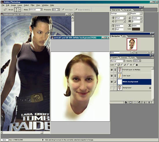 |
The Eyes Have It Okay, I'm ready to clip the image from this file into the poster file. But the highlights weren't bright enough. So now I go into the portrait layer (on top) and I use the dodge tool which lightens the highlights a little more. I also use the burn tool to darken that shadow around the neck below the chin. This gives the head even more dimension. And finally, The eyes. I whiten the whites and add a spectral highlight dot to each pupil. This gives the eyes a shiny natural look. |
|
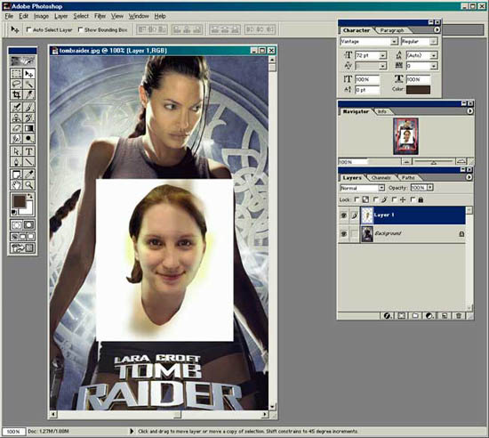 |
The portrait now occupies a layer in the poster file with a simple copy and paste command. I will now trim away the white. I'm using the vector tool to create a clipping path, and when the path is complete, I will feather the selection about two pixels so the edge isn't too crisp. You want a soft edge to blend the assembled pieces properly. | |
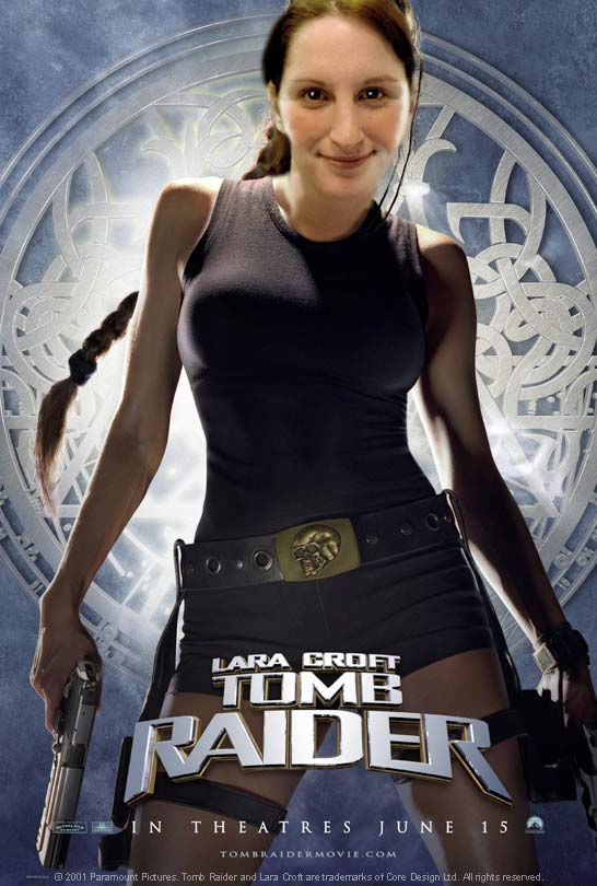 |
Of course I used the smudge tool to smooth out and blend the edges. But I'm very satisfied, and in fact surprised at the results. I used an outer glow on the head to replicate the backlight in the original poster, and it helps further blend the elements together almost seamlessly. I used the eraser to remove the neck portion I didn't use (Angelina apparently has a demure neckline). The portrait could be a little darker, but heck, it's a caricature/parody for God's sake. I got lucky on the hairstyle, too. Kate's ponytail blends in perfectly with Angelina's braid. Color is perfect match. |
|
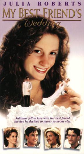 |
Kate Shaffer as Julia Roberts. This is an incredible example of PhotoShop magic. How Kate managed to blend her images is a wonderful example of not only her skills with the application, but it's clear she has artistic and creative capabilities. | |
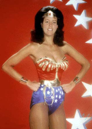 |
Kay Heller is WonderKay. This is one of the best one of these I've seen. Kay brought the face into the Wonderwoman image from the back by deftly using layers and soft erase. | |
 |
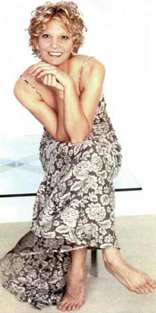 |
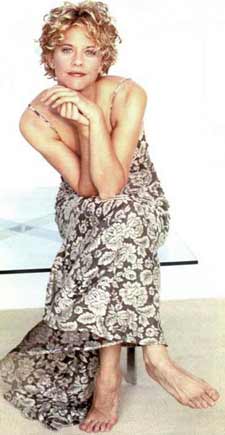
This is super. What a great match! Pat Mitchley found just the right shot of her face to make the switch. And look at that skin match. Pat brought the face in through a layer below the image of Meg Ryan. soft erase of Meg's features reveals Pat's features beneath. |
 We
are using PhotoShop of course, and this lesson emphasizes the use
of layers and layer properties in helping you build better composite
images. A composite image is one image made up of several other
disparate images from a variety of sources. We used our digital
camera, here, and the resolution of everything is 72 dpi with image
width maxed at 725 pixels.