|
Notepaper Note that there is more room on the sheet. I reduced the tapper and hand to less than half its original size. I moved your name to the upper right to give it balance. You got loads of room. The logo in the corner should be in color like the rest of the sheet. I also distorted the logo that is beneath the beer spill just as it would appear in real life. I did reduce the logo, but I wouldn't make it any smaller. Keep in mind, the best correspondence is brief with lots of space around it. You should never fill this sheet with text. Beneath your name you can put a subject line or a "To: SoAndSo." Note that I added bubbles in strategic spots in the spill. It really adds depth and life to it. Sometimes I amaze myself. Therefore, I would recommend it be printed on a smaller stock and trimmed to a sheet 8 inches high maximum. This way it can be folded in half and put into a standard envelope, paper clipped to a report or large sheet of paper. I've resaved the file as a JPG and integrated into two Microsoft Word templates. This way you could just open it up on your computer, type away, and output the note on an office laser printer. |
This is the 6x9 inch format. Click on the link at left to download the stationery with the graphic embedded and text boxes in place. Important note: you really can't print full bleed (off the edge) when printing to a laser or ink jet printer. Now a commercial printer can print full bleed because they just trim the sheet after it's printed. There will be a white margin above the hand which will form a frame or vignette. If you don't want this and want a full bleed off the edge on top, just cut the top off to the edge of the hand. If you have a good paper cutter in the office, this will work great. |
 |
This project is particularly interesting because the finished product is a large framed montage of images including some fascinating and colorful beverage distributor memorabilia, collected items from Kirchhoff's long history. Did you know the firm started out as an ice cream company? |
|
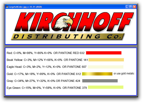
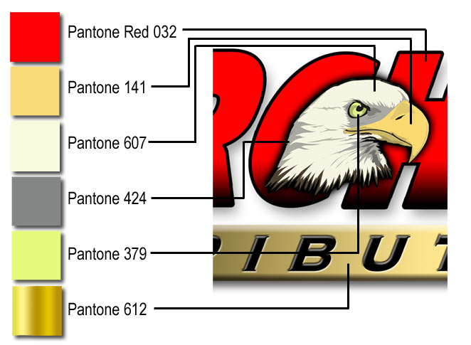
Logo Graphics, Type and Color Scheme Note that the logo at right is a full-color logo, which means to get the good blends and depth, the logo must be reproduced in a four color process which may be impractical for some applications where you can only use solid colors. In the event solid colors are used, the above color fornulas and Pantone equivelencies have been provided. A good vector logo for spot color applications is featured below. On the gold metalic part, it's best to use a gold metalic if you're working in decal vinyl. But if you are screen printing a flat color, Pantone 612 will work.
|
 |
|
|
|
|
Kirchhoff
Distributing Co. Logo Files
|
|
| Black and White JPG file in grayscale. Image is 300 dpi and 8.28 inches wide. Jusdt click on the files at left to download to your browser or directory on your hard drive or network. Good for most one color print application where color is necessary. Can serve as a shape reference for embroidery pattern. | |
| NEW! All Black file, which means this is a black only file that can used on multi-part NCR paper (billing) and other limited-to-black only applications. The eagle's head is a dithered halftone which will print beutifully without any screening or further manipulation. | |
| Full Color JPG file in RGB (uncompressed) 300 dpi, 8.28 inches wide Excellent for most signage, banners, etc. It can even serve as a color reference for and embroidery pattern. | |
| Dubuque, Iowa Address #10 envelope. Envelope has a text field for addresses in Microsoft Word Template format. Because it is a Word Template, you can use this envelop in a mass mailing, mail-merge application in Word. Will print on a color laser printer or ink jet printer. | |
| Clinton, Iowa Address #10 envelope with adress text field (as above) | |
| Stationery in Microsoft Word with logo embedded in header. | |
 |
Business cards by the sheet: You just have to put in the phone numbers in the phone numbers field lower right, and you can change the name and title at will. Perfect for color laser printer. You can do one name on a sheet or several different names depending on how many cards you need for how many people. |
|
|
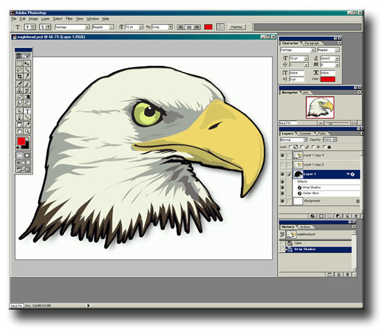
Eagle head files:
|
| Vector File: Adobe Acrobat PDF in vector format that is infinitely scalable up or down. You can print this image as big as a billboard and it won't lose it's resolution. | |
| Vector File for Publishing and Signage: This is a self-extracing archive containing three separate files: a vector file in eps format, along with a native FreeHand file and an eagle's head JPG file that is included in the .eps and FreeHand files. So keep them together when stored on your hard drive or server directory. You need all files to print, especially when using this file in a page layout program like Quark or PageMaker. | |
Kirchhoff Distributing Co. Stationery
This is a stationery sample prepared in Microsoft Word. When you deploy in Microsoft Word, click two times on the header in which the graphic is embeded, and you can customiz the text line beneath the logo.
The cards are layed out on letter sized sheet. Use good quality linen or textured laser paper. The lines are your trim marks. If you have a reasonably good paper cutter, trim the cards as follows. Your first cut should be down the middle from top to bottom. This way you'll have marks in strategic locations allowing you to accurately trim the rest of the cards.
Logos
Here's a large view of the full color logo
The black and white logo
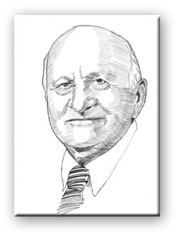
 his
is the Kirchhoff Distributing Company Logos and Graphics page on
garyolsen.com. At left is one of the patriarchs of the company whose
portrait is part of a large graphic design project celebrating the
legacy and history of Kirchhoff Distributing Company. A special
series of portraits was prepared by Gary Olsen, and you can see
the evolutionary process of this commission in a virtual studio
right here on this Web site.


