This is The Poster Project
To the Newsletter Assignment | To the Brochure Assignment | To the Calendar
This is the new gallery for our students in the Quark Xpress Class, first half of the second semester of 2000-2001 school year. We have a full class and several of the students have taken previous Bootcamps from me, and that's a good thing. There's an expectation level that students understand from previous experiences with me.
Below is the first project in the Quark Class which utilizes all of the basic functions of the program... objects, text boxes, custom color palettes, type selection and manipulation, lines, files, etc. As usual, I post the assignments here, and comment on them. Right now I'm still collecting everyone's assignments, so keep checking back for more great art.

Jen Georgen. This is a perfect application of Quark's text handling abilities, not to mention Jennifer's exquisite talent for layout and design.
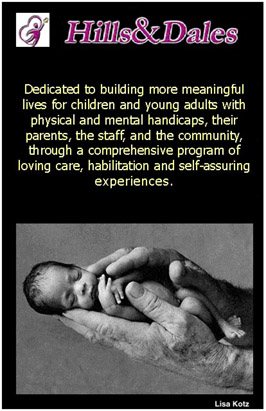
Lisa Kotz did a beautiful job applying Quark's application of color as well as image importation, manipulation, and management capabilities. This is Lisa's first class with me, and already I'm impressed.
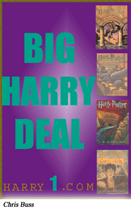
Chris Buss, another new student with the Bootcamp. I think he's figured out Quark's graduated fill potential here. I'm a huge Harry Potter fan, myself, so I really love this piece. Though I never stress that this first exercise is competitive (learn functionality rather than try to break new design ground), I still enjoy the creative output.

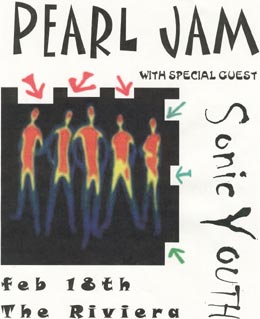
My good friend Ann Lorenz relies on one of her favorite themes... dogs. One of the keys to this lesson was to figure out the type manipulation capabilities of Quark. Good job on this.
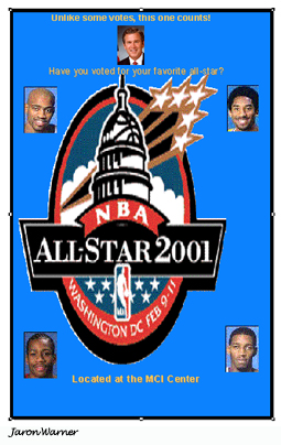
Jaron Warner plays basketball for Clarke, and his obvious choice of design subjects. But what's extremely cool here is how Jaron imported and framed the photos against the blue background. Good use of layer management here.
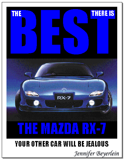
Jennifer Beyerlein and I worked together on that type element on the top as a class demonstration, and I thank her for the opportunity. But the overall piece, especially the composition and color choice, the image manipulation, are all Jennifer, and indicate she is going to continue producing interesting work this semester.
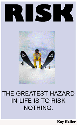
Kay Heller did a fine job of layering and text manipulation here. A fine first effort. I particularly love the minimalist approach on the headline, and how she sized it precisely in Quark. Quark is all about precision.
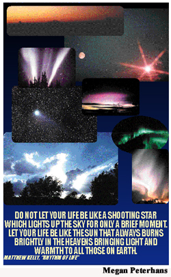
Megan Peterhans took this first assignment to a local print shop and had a large poster made, laminated, mounted, and it hangs in her room. So cool. Megan already has a comfort level with the program, and she helps me with the other students in the class. But I've managed to teach her a few things despite the fact she is an expert. Like she's never really harnessed Quark's power to build library items and style sheets. Quark in the hands of a talented person like Megan is a wonderful thing to watch.
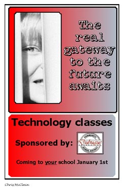
One of my favorite students, Chris McClain. I've had her in four classes, I think. She's combining all the things she's learned in previous classes, and now Quark is going to help her pull it all together in complex document publishing.
I really enjoy working with Jean Francione. She is a true talent. I thoroughly enjoy her edgy artistic sensibility. You want to see something cool? Visit our PhotoShop Student Gallery from last semester. There's an extraordinary image she did for that class that I put at the top of the page. Anyhow, it will continue to be interesting to see how Jean applies her unique talent to Quark.
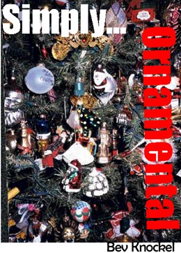
It's great to have Bev Knockel back in my classroom. Bev was in my video class, and it was wild. She is so enthused, it's contagious. She took a photo of her Christmas tree here, imported in Quark, and superimposed the type. Simply Ornamental is simply wonderful!
Julie Hoffmann is another pal of mine from previous classes. Don't you love this use of type and image blending into background? She does very interesting things, and, once again, I look forward to her spin on future projects using Quark Xpress.
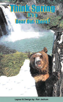
Ron Jochum is one of the most prolific designers I've had. He tackles extremely ambitious projects. Here in Quark, he discovered that a good way to create decorative dimensional type within the application was to copy the text box, make the background invisible, and paste an offset copy of the text on top.
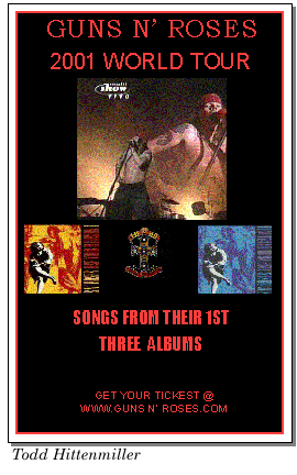
Todd Hittenmiller did a nice job interpreting my instructions on color palette management. The red frame around the black background is well chosen (matching the type), and the contrasting color works well against the background. Once again, precise choices Todd was able to make using Quark Xpress. Also, nice job framing the image boxes and arranging them in an excellent composition.